Fall 2025
Nourish
Community-Based Mobile Food Access For Older Adults
A grocery and hot-meal delivery truck paired with an optional website, designed for older adults facing transportation, mobility, and digital access barriers, built around trust, predictability, and dignity rather than speed.
Mixed-Methods Research
Service and Interface Design
Accessibility-First UI
Duration
Aug 2025 – Dec 2025
Role
Product Designer and UX Researcher
Key skills
Quick Snapshot
Who
Older adults aged 60+, especially those in food deserts with limited transportation, mobility constraints, and/or low digital comfort, along with local service providers supporting seniors.
What
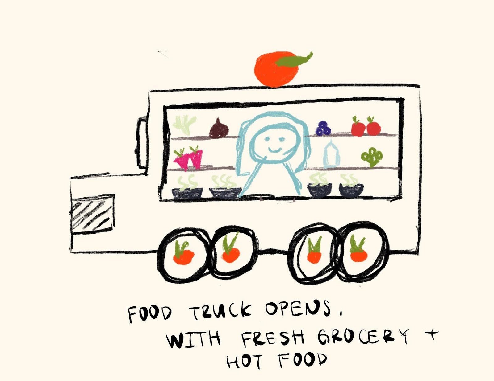
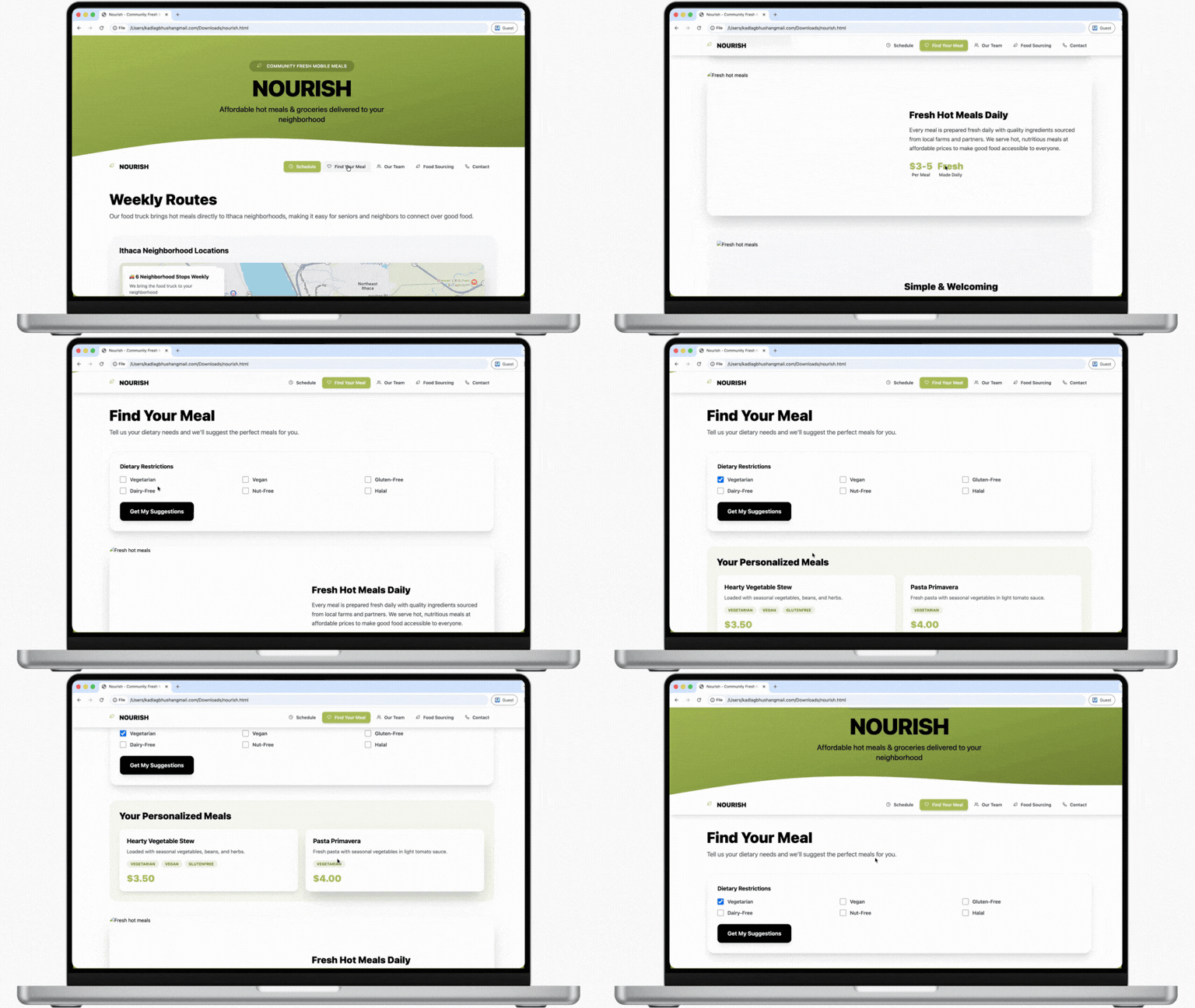
Researched and designed a mobile pantry and hot meals service with predictable routes, low-tech access, and community-first touchpoints, paired with an optional informational website (not a required gate).
When
Aug 2025 – Dec 2025
Why
Food access isn’t just “distance to a store.” It’s compounded by fatigue, safety risk, dietary needs, and isolation, along with many “modern” solutions that quietly promote tech literacy.
Problem
Background
- Food deserts / low access are real at scale: USDA estimates 18.8M people (6.1%) live in low-income, low-access areas (≥1 mile urban / ≥10 miles rural from a grocery).
- Transportation makes it worse: USDA also notes ~1.9M households are low-income, have no vehicle, and are far from a store.
- Older adults are already at higher risk: Feeding America reports 6.9M adults 60+ faced food insecurity in 2022 (~1 in 11).
- Digital-first delivery is a hidden gate: Pew reports 65+: 76% smartphone ownership and 65% home broadband, meaning millions still can’t rely on “just order online.”
Problem
Older adults in food deserts face a compounding set of barriers like transportation limits, mobility/fatigue, dietary constraints, and digital exclusion, that turn getting groceries into a high-effort task. Many existing options either require technology or still require seniors to go outside and physically manage pickup, and assistance programs can feel confusing or embarrassing. The result is reduced autonomy, inconsistent nutrition, and increased isolation.
How might we?
How might we help older adults in food deserts access fresh groceries and hot meals in a way that is predictable, low-effort, and dignified, while also supporting trust and social connection, without requiring digital literacy?
Research Methodology
Market research
We reviewed 12+ existing food-access models (e.g., meal delivery programs, mobile pantries, CSAs, grocery delivery) to understand what already works and where older adults still fall through the cracks. The goal was to avoid reinventing the wheel and instead design for the gaps: tech reliance, unclear scheduling, limited choice, and physical barriers.
Interviews and surveys
We interviewed older adults aged 60+ and staff from a local senior-support non-profit to capture both lived experience and system-level patterns. We used additional concept feedback (survey/video-style checks) to validate clarity and trust early, without over-investing in a single concept too soon.
Results
Market research insights and gaps
Existing models have strong reputations and real value, but gaps persist for older adults:

Technology-dependent ordering

Inconsistent/unclear scheduling

Limited choice

Physical barriers that still require leaving home
Interview and survey insights
Across our research/evaluations, older adults consistently prioritized:

Across our research/evaluations, older adults consistently prioritized: Trust & familiarity, predictable schedules, clear communication, low-effort participation, human contact, dietary support, and access without technology.

We also learned there’s no single “senior persona”; the needs vary widely by location, income, diet, mobility, and support networks.
Design direction
We chose a grocery truck model because it can address mobility, affordability, technology barriers, and social isolation in one coherent service, while building on real-world models like mobile pantries/community food banks.
Design Process
Ideation
We explored multiple directions (grocery trucks, meal subscriptions, mobile pantries, neighbor meal exchange). We converged on the truck and service model because it best reduced dependency on apps while still enabling routine and community contact.
Design decisions and prototypes
Truck and service prototyping (low, mid, and hi)
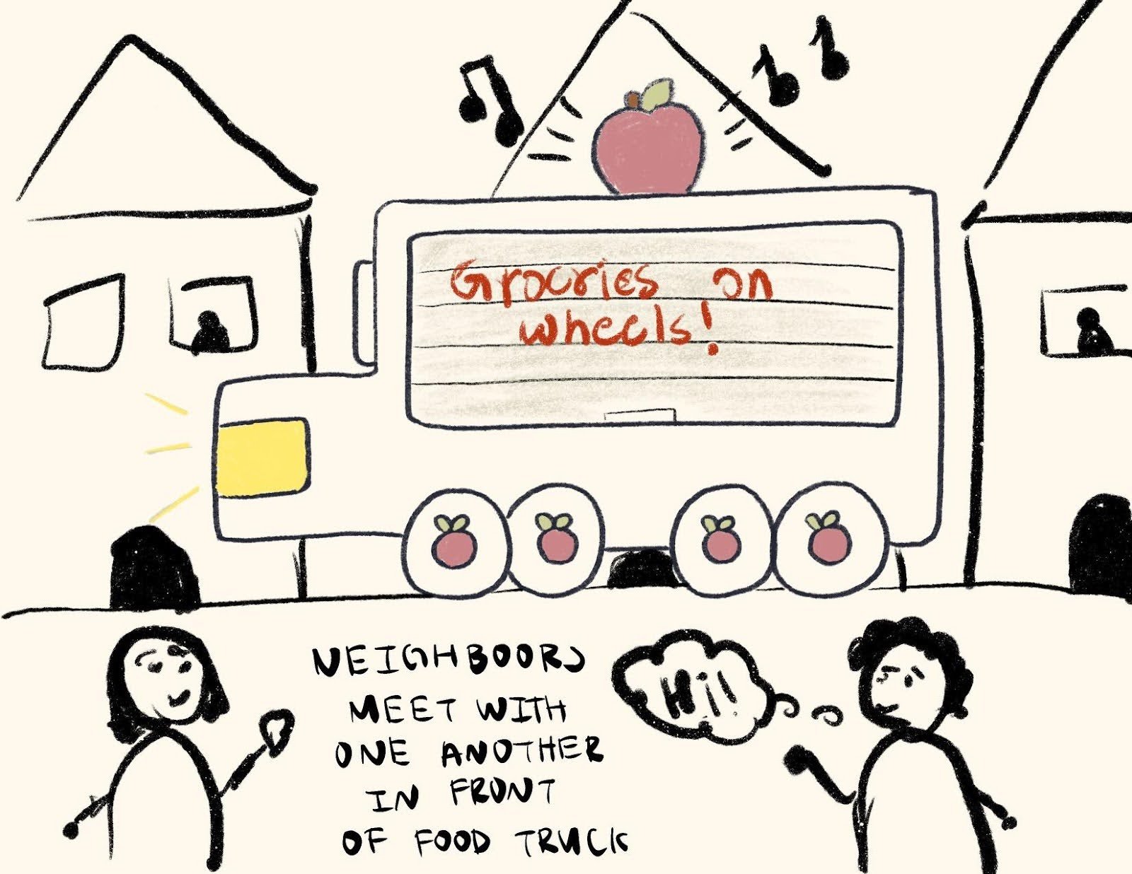
- Low-fi concept walkthroughs: used to test if the flow felt understandable before polishing visuals (service ideas fail in the “steps,” not the slogan).


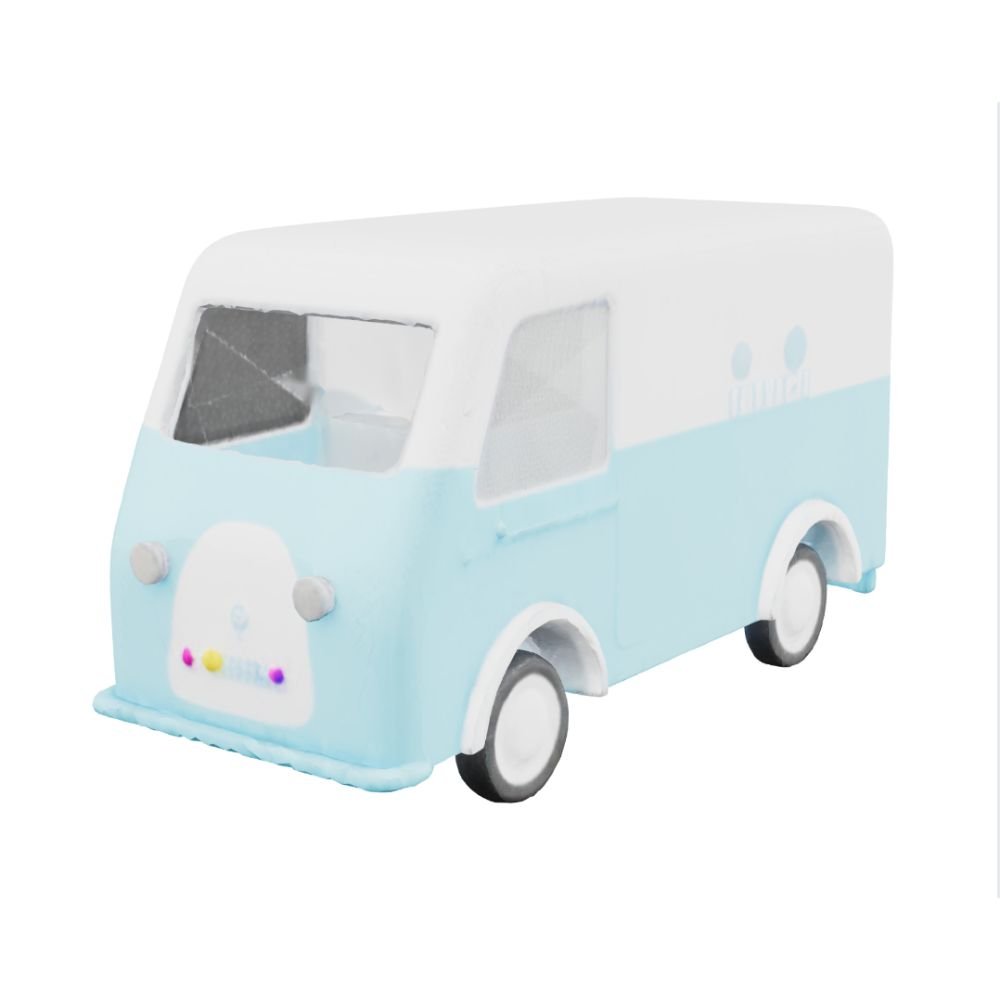
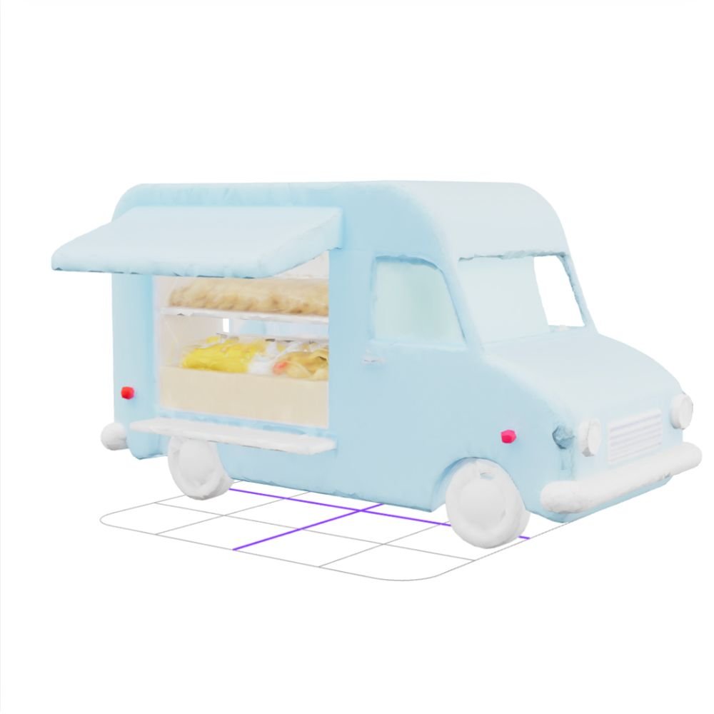
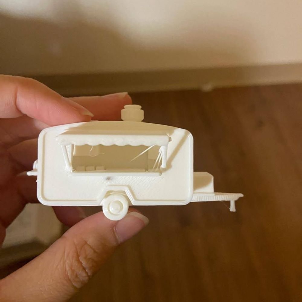
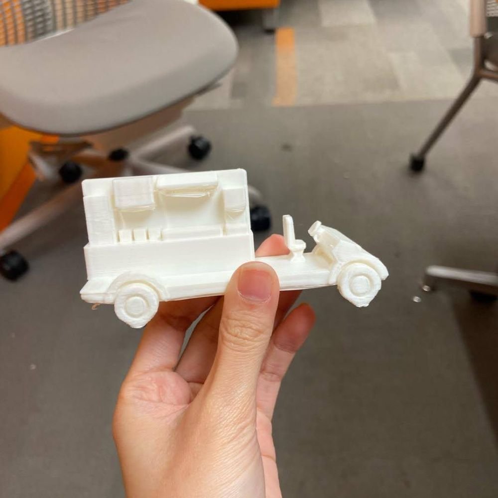
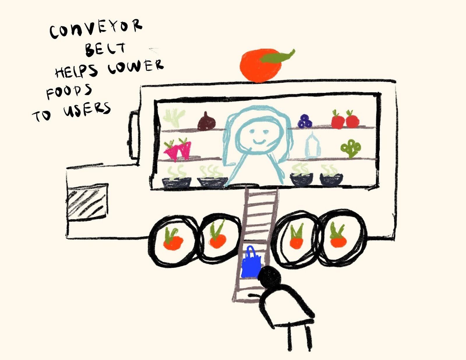
- Mid-fi iteration informed by early feedback: users disliked a conveyor belt delivery, so we redesigned a high fidelity prototype with a 3D printed physical prototype for safer and easier access.


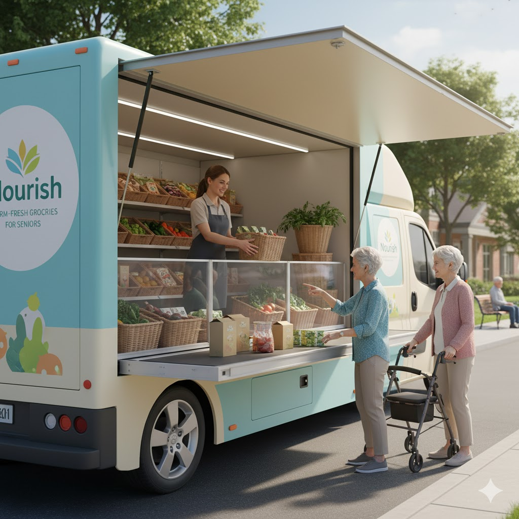
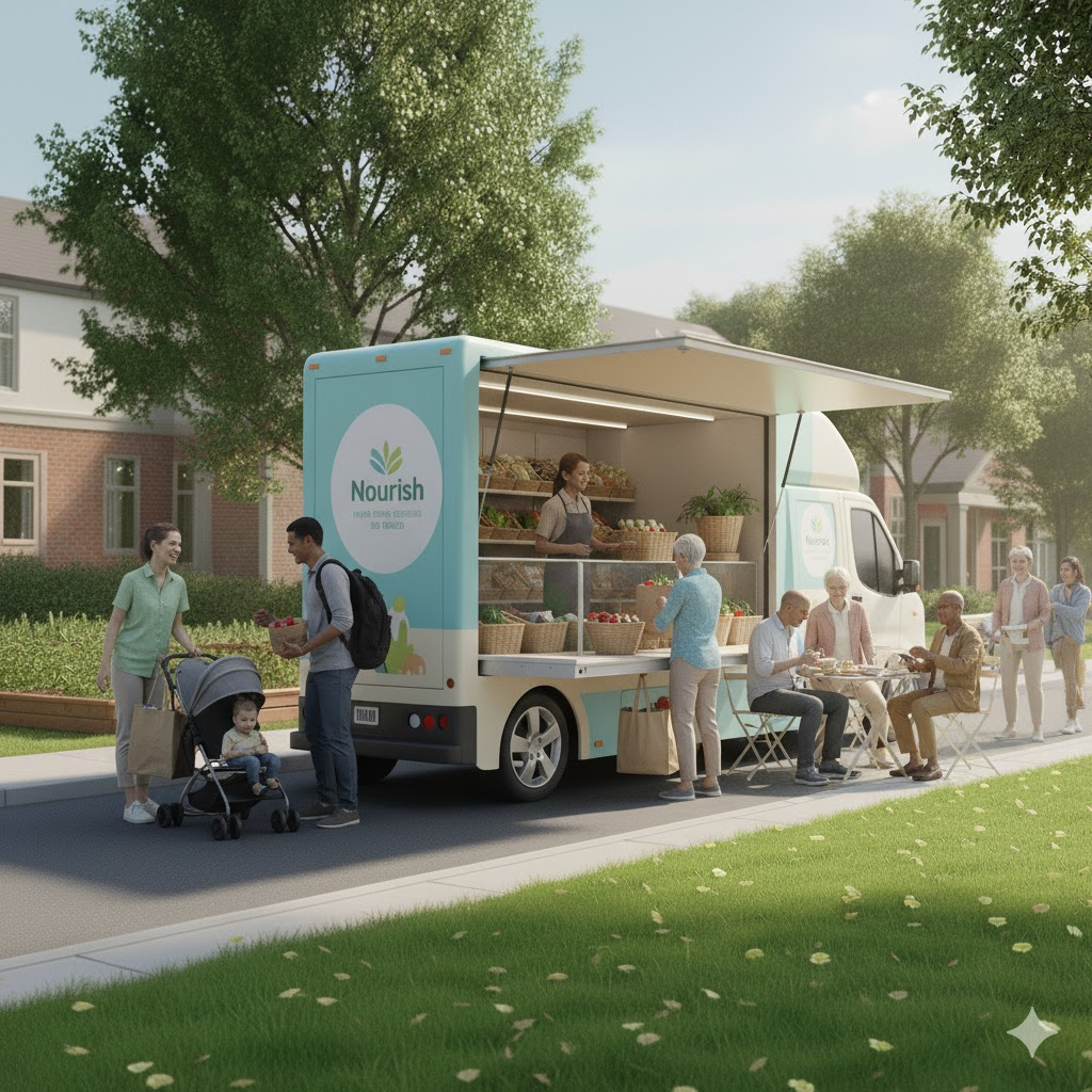
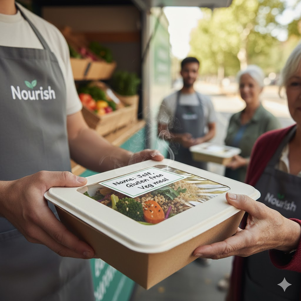
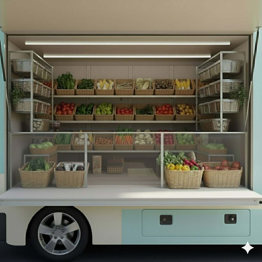
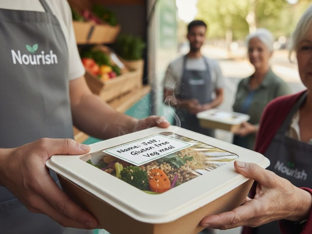
- Hi-fi visualizations: We used rigorous AI prompting to visualize realistic truck scenarios (so participants could react to approachability, safety, and layout cues when we couldn’t build a full vehicle).


Truck design principles
- Lowered service ledge; no climbing/bending/heavy lifting to reduce fall risk and physical strain, especially in snow/ice.
- Clear display board for items
Why: Reduces cognitive load and decision fatigue; supports low vision; avoids pressure to “browse inside.” - Multiple ordering modes (phone, paper, in-person)
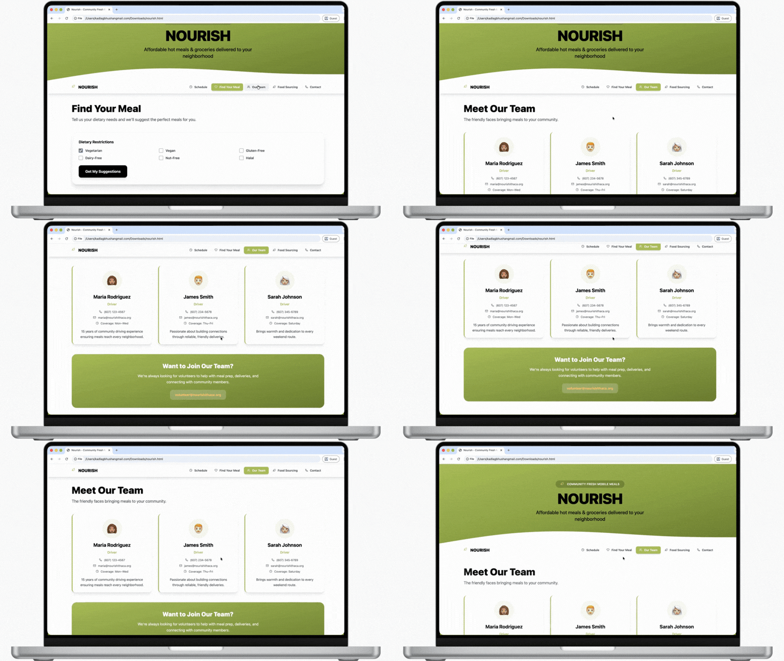
Why: Respects different comfort levels; prevents digital exclusion. - Same staff on the same route and driver profile (photo/bio)
Why: Trust grows through familiarity; reduces anxiety about strangers and safety concerns. - Flexible payment (cash/card/SNAP; online or in-person) to prevent exclusion based on payment comfort or internet access.
- Human connection as a feature, not a bonus, as loneliness impacts appetite and motivation; routine interactions can directly support nutrition.
Website design principles
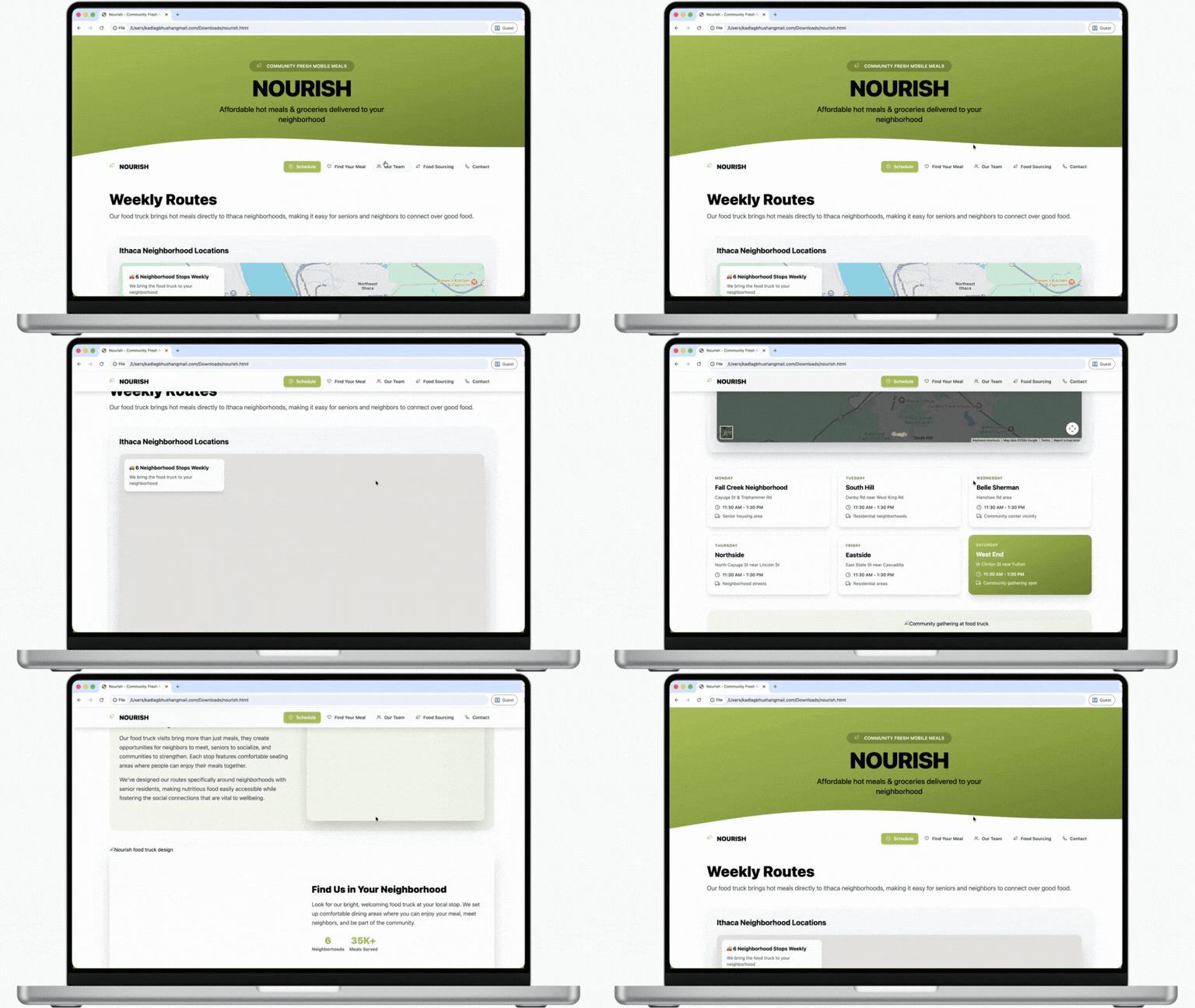
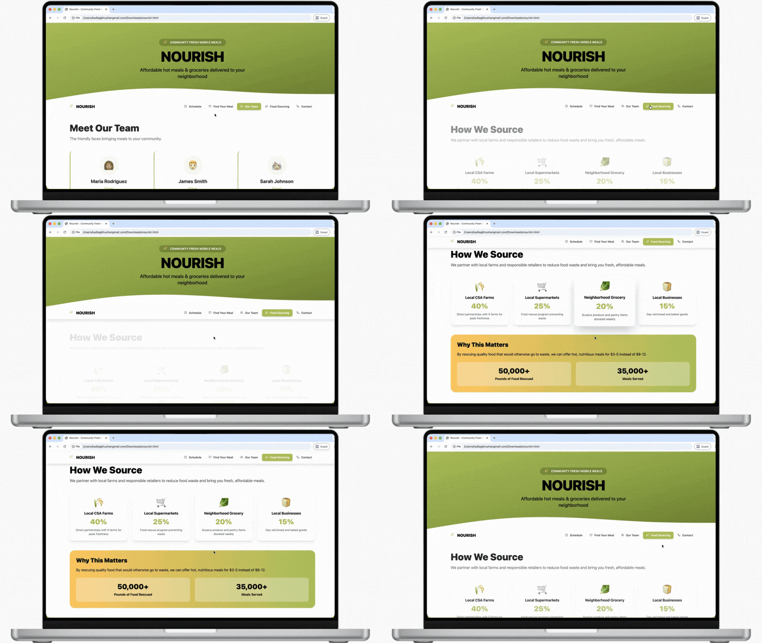
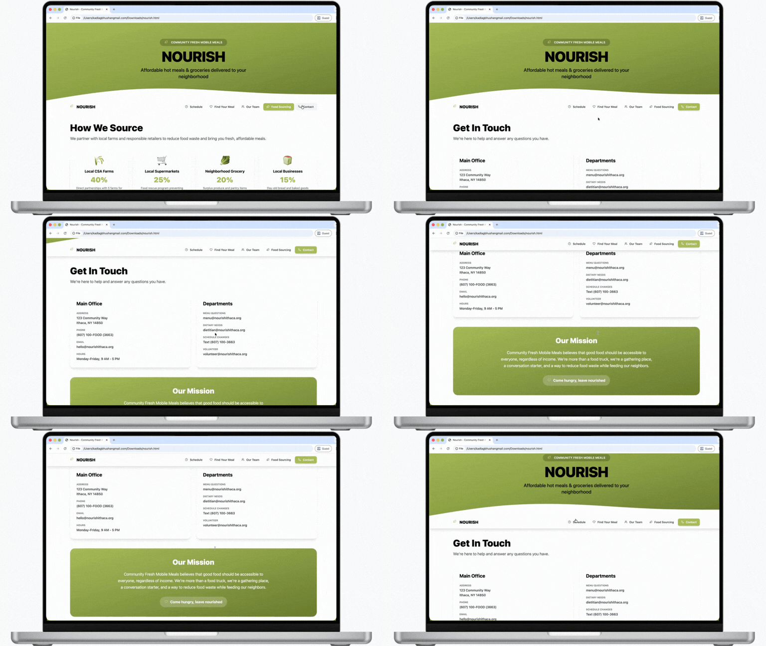
- Large typography, high contrast and simple layouts
Why: Improve readability for low vision; reduce cognitive load and ambiguity. - Schedule predictability and map-based confidence
Why: Predictability reduces anxiety and helps users plan around energy levels. - Transparent pricing
Why: Cost uncertainty undermines trust; visibility reduces stress and increases willingness to try. - Driver profiles and phone numbers
Why: “Real person” contact ability builds safety and reduces abandonment when confusion happens.
Evaluation
Testing methods
We evaluated iteratively because service concepts break in the seams (ordering, waiting, handoff, trust signals):
- Discovery interviews to find the experiences/needs/constraints
- Low-fi concept feedback via interview/survey-style prototype review
- Wizard-of-Oz service simulation to simulate ordering, route communication, and handoff without a real truck
- Medium-fi user testing to refine the prototype direction
Results
- Users prioritized trust, predictability, clear communication, low effort, and human contact repeatedly.
- Social design wasn’t “cute”; it was functional: Nourish was strongest when it created meaning and relationships around weekly food access.
Changes implemented
- Removed the conveyor belt to replace with lowered service ledge to reduce fall risk and discomfort.
- Strengthened the predictable routine communication (same times/locations; simple reminders) to reduce the uncertainty and planning burden.
- Kept the website optional to improve trust without excluding users who can’t/won’t use it.